![X Highlights Back-To-School Marketing Opportunities [Infographic]](https://imgproxy.divecdn.com/dM1TxaOzbLu_kb9YjLpd7P_E_B_FkFsuKp2uSGPS5i8/g:ce/rs:fit:770:435/Z3M6Ly9kaXZlc2l0ZS1zdG9yYWdlL2RpdmVpbWFnZS94X2JhY2tfdG9fc2Nob29sMi5wbmc=.webp)


Don't call it a Mac – I went hands-on with iPadOS 26 with true multitasking, a revamped Files, and a menu bar, here's what you need to know
It's the upgrade iPad users have been waiting for
Well, for the iPad faithful, Apple’s WWDC 2025 keynote was the day that faith was rewarded. I, like countless others, have been waiting for a major upgrade for iPadOS, and the Cupertino-based tech giant delivered.
Yes, iPadOS 26 brings with it Liquid Glass, but more importantly for all iPads that support it, you’ll get actual windowed multitasking, the ability to drop folders in the dock, a menu bar up-top, one of the most addicting gestures I’ve used, and the ability for tasks to run in the background.
Easily, it was the standout moment from the keynote, and I got to go hands-on briefly with iPadOS 26 running on a 13-inch iPad Pro with M4 attached to a Magic Keyboard with an Apple Pencil Pro.
Now, let’s address the elephant in the room – allowing those landmark features I listed out above makes the iPad seem like a Mac, but don’t call this a Mac. Yes, Apple did take some features from the Mac rather than reinventing the entire concept – say, for the close, minimize, or expand buttons in the top left or the menu bar – but this is all well thought out for the iPad, and takes advantage of one of the best parts of an iPad.
Multitouch.
With the iPad’s approach, it’s sort of a choose-your-own-adventure, while on the Mac, it’s keyboard and trackpad. I used it and saw a demo of fingers controlling the windows, as well as using the Apple Pencil to move items around and even the cursor. It's all about control, in that however you see it and want to use it, you can do so to get more out of your iPad. Let’s talk about why.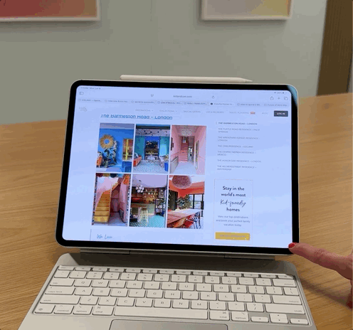
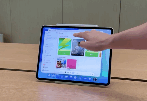
Let’s start with the most exciting part – from any app, you can pull from the bottom corner – it’s set with an effect, a slightly darker edge in the bottom right – to easily resize the window by pulling it back and forth. So from full screen, you just pull it towards the other side to make it smaller, by width or height, and then you can grab the top of the window to place it where you like.
Using the dock, you can then drag and drop another app up or do a swipe up for the peek mode to access your home screen and place any app in this layout. It’s really smooth and lets you finally have your ultimate iPad layout. Maybe that’s a Safari window open to a Google Meet in the corner, the reminders app for your checklist, and your email as you start your day.
You can also split the screen with an image and then open an app like ProCreate, allowing you to see your starting point while drawing something awesome. It really lets you tailor the experience to how you see fit.
Now this new windowing setup does replace SplitView and SlideOver, and while that didn’t excite me when I first heard, I do like the various preset options you can pick from via a long press in the top left corner of any window and the new gesture.
With a flick to the left or right, you can effortlessly split your screen and then adjust it further by moving the slider in the middle as needed. This feels like an easier way to achieve a similar result to SplitView, and is quite frankly fun to do.
You can also tap the top of the iPad’s screen to access a menu bar for things like more precise settings or easy exports – it’s the most similar part of the experience to the Mac. Still, considering it’s hidden until you need it, I think iPad power users will likely get the most out of this.
It feels really natural in this implementation, and not a cookie-cutter copy and paste from the Mac, given the updated elements and the ability to control with both touch and a trackpad.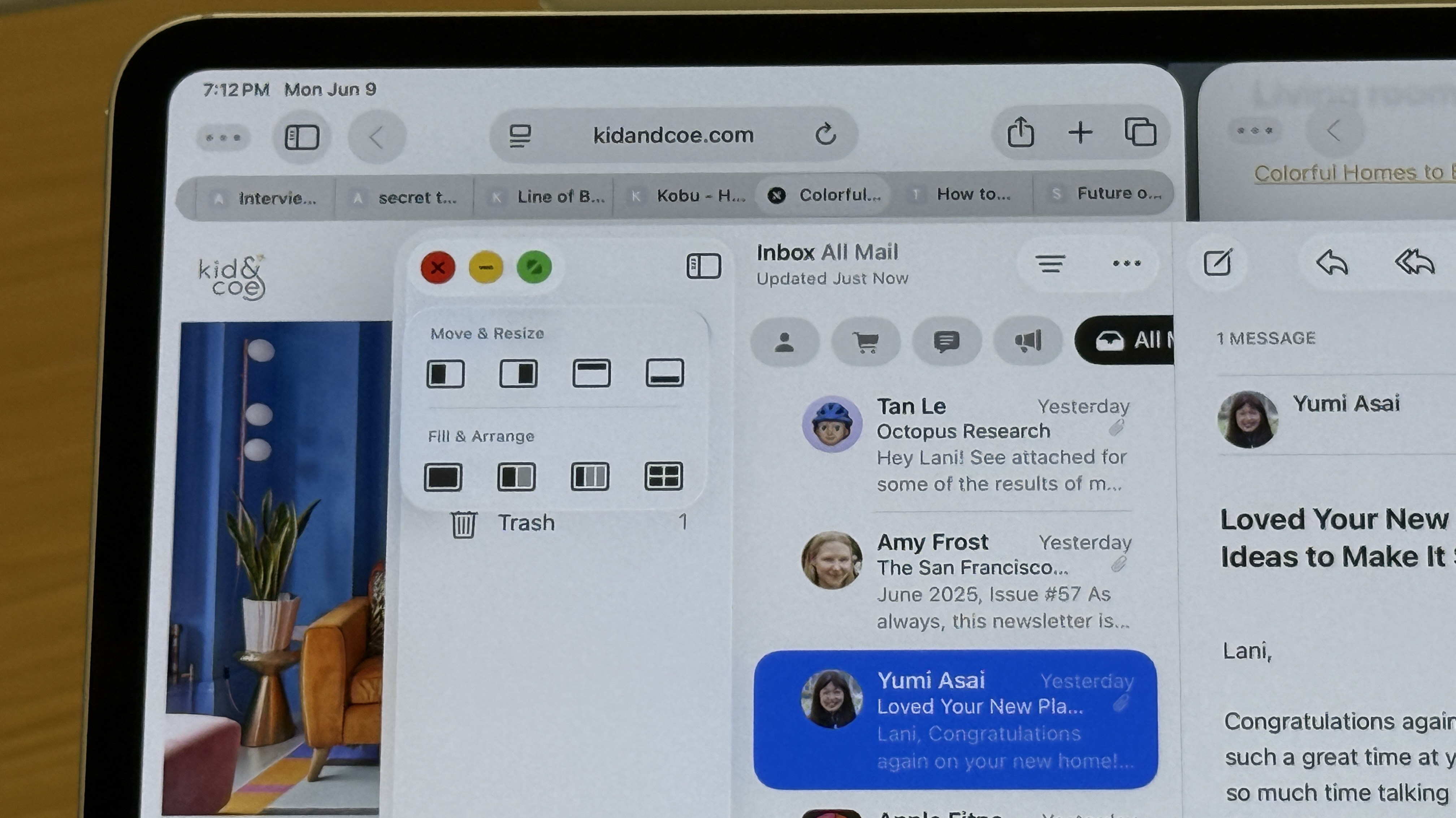
Complementing the new multitasking approach is a significantly improved Files app and a dock that can now display a live folder. The app will feel familiar, but a new list view with the ability to customize modifiers, also known as the columns you see, will really let you tailor this for your specific needs.
For instance, I could see myself sorting by last modified and then pulling the folder containing images to the dock to edit in an app like Pixelmator, export, and then upload it into a content management system for a story build. Changes you make within folders or to these layouts can be synced across devices and updated in iCloud as well. If you’re a fan of colored folders and keen to name with emojis, you get this as well.
Those larger exports, maybe a batch photo editor or video export from Final Cut Pro, can now run in the background. I got a demo of this, and it either lives at the top of your device with a progress bar or in a little icon near your time where you can track multiple exports or tasks.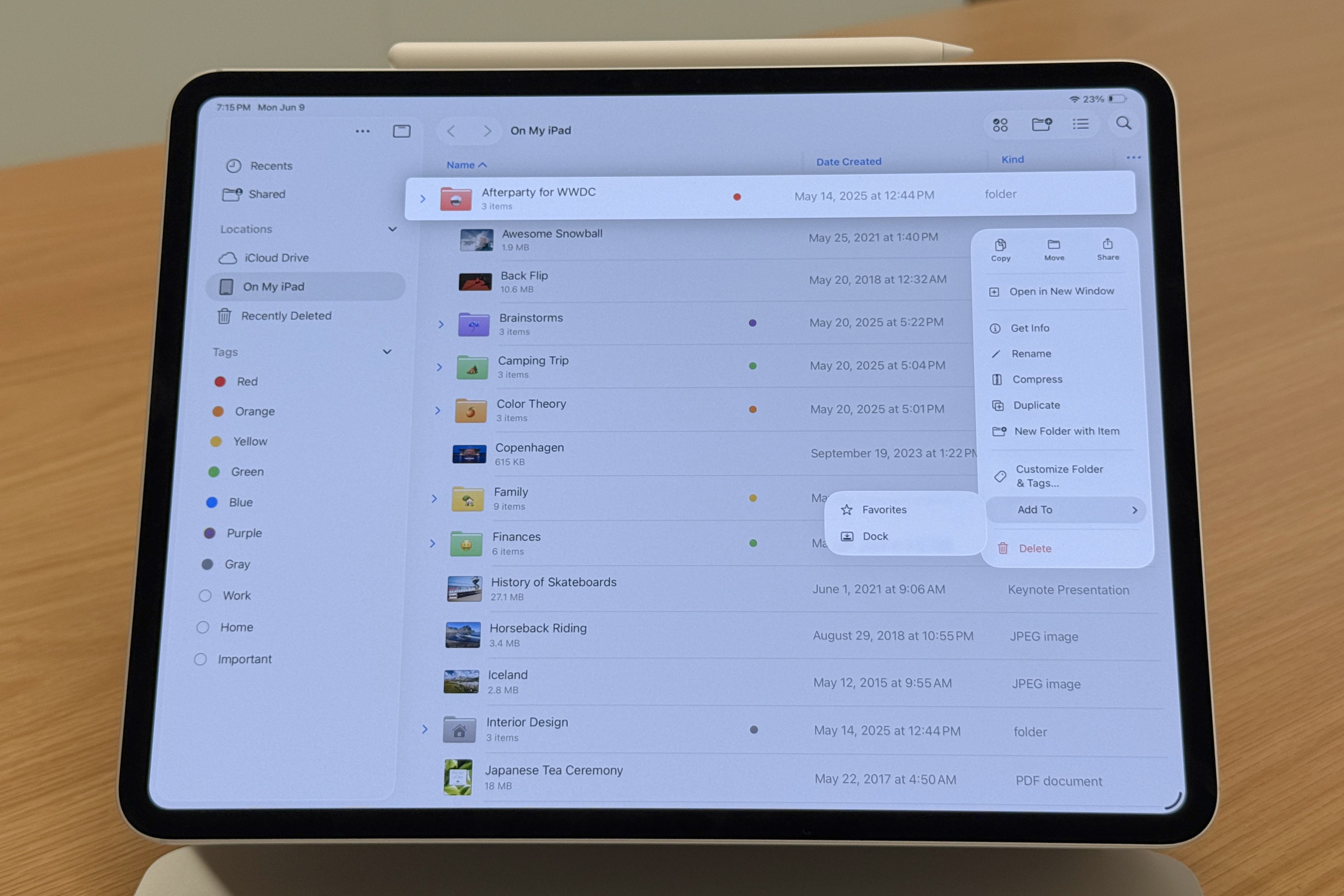
The really exciting part, even from these demos and a little usage, is the fact that this isn’t just limited to the iPad Pro with M4 or the iPad Air with M3 or even another step-up model. This new multitasking experience is the result of a new ‘Window Prioritization Model’ that works in conjunction with the performance and resource manager. It has been entirely re-architected to run on any iPad that supports iPadOS 26.
Meaning that the 9th Gen iPad – one of the best values Apple’s ever released – will get this new multitasking experience, same for the 10th, 11th, or 13th Gen, the iPad Air, iPad mini, and Pro. You might not be able to open a dozen there all at once, but it will let you push the chip inside further.
For now, iPadOS 26 is in a developer beta, which means it's not for your main device as bugs and issues are to be expected, but a public beta will arrive in July, and this will be released for everyone with an eligible device in the Fall. I’m super excited to spend time with it and eventually give it a full review treatment, but for now, it’s the upgrade we’ve been waiting for that feels distinctly like an iPad.
Sure, the Mac has long been the ultimate in productivity, but that lacks touch and is truly designed for keyboard and trackpad. The iPad is multitouch first, and Apple really put the time in to craft an experience that feels purpose-made for multiple inputs, with touch being first.
Just fair warning, I’ll be using many, many windows.