


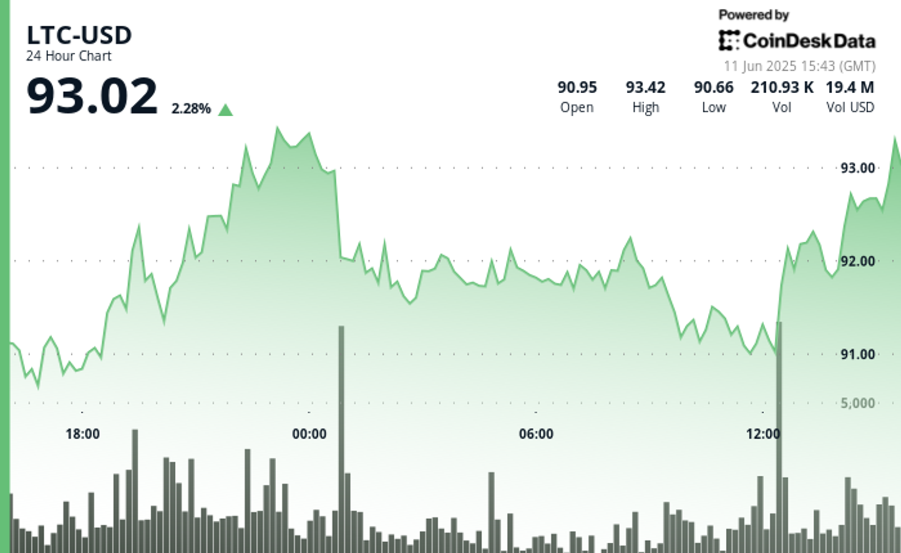


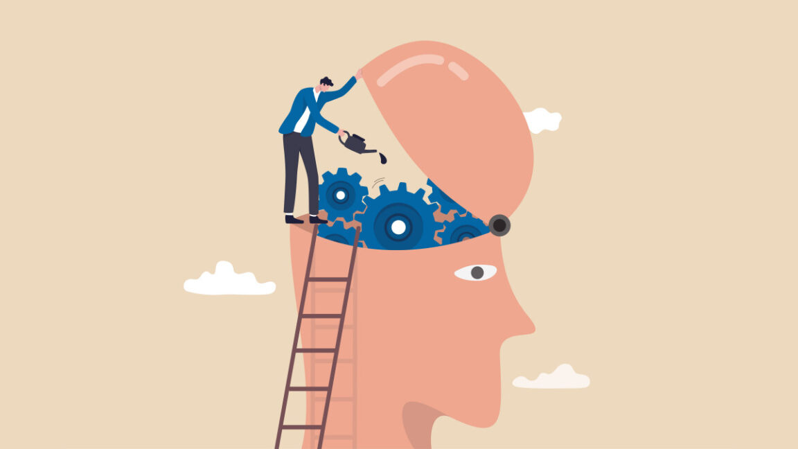


RIP to the almost future of computing: Apple just turned the iPad into a Mac
Apple has killed the future of computing. With iPadOS 26, it turned the dream of computing visionaries like Alan Kay and Jef Raskin (and of Steve Jobs and Jony Ive, too) into an overpriced touchscreen MacBook with an optional keyboard. Back when it launched in 2010, the iPad was meant to be the escape hatch from the cluttered, file-strewn, window-management hellscape of traditional computing. It was the ultimate expression of Kay’s Dynabook, a book-like device that was mostly screen. Kay, a legendary Xerox PARC computer scientist, imagined that the Dynabook would democratize access to computers without people having to learn arcane coding languages. Today, though, the iPad has become a cluttered compromise. Apple has transformed the iPadOS into MacOS with some touch UX details. Now you can make apps run in windows that can overlap each other, just like the way you can run many iOS and iPad apps in the Mac. There are menus and submenus too, which run across the top of the screen in some apps, just like the Mac (but, unlike the Mac, they are not a permanent UX element, appearing and disappearing depending of the app you are running). Windows can tile, turning it into a finger-clickable oversize pop-up window. [Image: Apple] The power of modal UX Apple believes that all this brings more power to the user. I would argue that it detracts from it, like Raskin discovered while developing the first Macintosh computer before Jobs took it away from him in 1981. He was a computer engineer, artist, writer, and human interface expert, who originally advocated leaving the command line interface for computers with a single purpose that anyone could use without training, like a toaster or an immersion blender in the real world. These “information appliances” would have the right buttons, software, and network connectivity to perform specific tasks effortlessly. Raskin envisioned them becoming invisible to users—part of their daily life. Eventually, he realized that having one gadget for each task was impractical. His answer was the mouse and graphical user interfaces, which he believed could bring computing a bit closer to his original idea. A computer could have programs focused on specialized tasks—like word processors, painting programs, or a calculator—with specialized interfaces designed so people could understand them intuitively. He started the Macintosh project at Apple in 1979, hiring legends like Bill Atkinson, the father of the menu bar and countless other fundamental graphic UX elements (who sadly recently passed away), Andy Hertzfeld, the main architect of the Mac’s system software, and Burrell Smith, who created the Mac’s hardware. He brought on other luminaries like Steve Capps (who later helmed the Newton project, the origin of the iPhone and the iPad), Bruce Horn (who created the Finder), and Susan Kare (who designed all the Mac’s icons and made all things wonderful in the pixel world), and they went on a mission to realize Raskin’s vision. Their genius ushered in the second computing revolution. And yet, the Mac wasn’t the solution Raskin had in mind. It required users to manage files and windows. It required them to learn conventions and navigate through menus, even if it was orders of magnitude more intuitive than the command line. Soon, it got too complicated—and still is to this day. No matter how many clean-up attempts Apple has tried, it’s fundamentally too complex. It wasn’t until the iPhone and touchscreens that Raskin’s idea materialized thanks to apps that turned to the phone into a “specialize device” for each task. Later, the iPad became the ultimate expression of that powerful idea. It embodied Raskin’s core philosophy: an immersive device focused and modal, that could transform instantly into the tool you needed—a sketchpad, a typewriter, a comic book reader, a video editor. Billions of people around the planet instantly got it. One app, full screen, your mind uncluttered. The complexity was hidden; its purpose was clear. The iPad was, as I wrote back for Gizmodo when it came out, “the future.” It wasn’t perfect by any means, but it had the potential to become the ultimate computing device. Years later, I changed my Mac for an iPad Pro. I loved it. The iPad put me in the zone and minimized distraction. I used it exclusively for several years and only changed to a Macbook Air because I needed to use Premiere for new projects. [Image: Apple] A squandered golden opportunity Which brings me back to iPadOS 26 and trying to understand its very existence. Fifteen years after Apple first introduced the iPad as a new form of computing we’ve landed back on the Mac. The company that once championed simplicity against the tyranny of overlapping windows and nested menus has now bolted those things onto the iPad. With iPadOS 26 the iPad is not a truly liberated information appliance anymore, free from desktop baggage. And it’s certainly not a full-fledged Mac—as i
Apple has killed the future of computing. With iPadOS 26, it turned the dream of computing visionaries like Alan Kay and Jef Raskin (and of Steve Jobs and Jony Ive, too) into an overpriced touchscreen MacBook with an optional keyboard.
Back when it launched in 2010, the iPad was meant to be the escape hatch from the cluttered, file-strewn, window-management hellscape of traditional computing. It was the ultimate expression of Kay’s Dynabook, a book-like device that was mostly screen. Kay, a legendary Xerox PARC computer scientist, imagined that the Dynabook would democratize access to computers without people having to learn arcane coding languages.
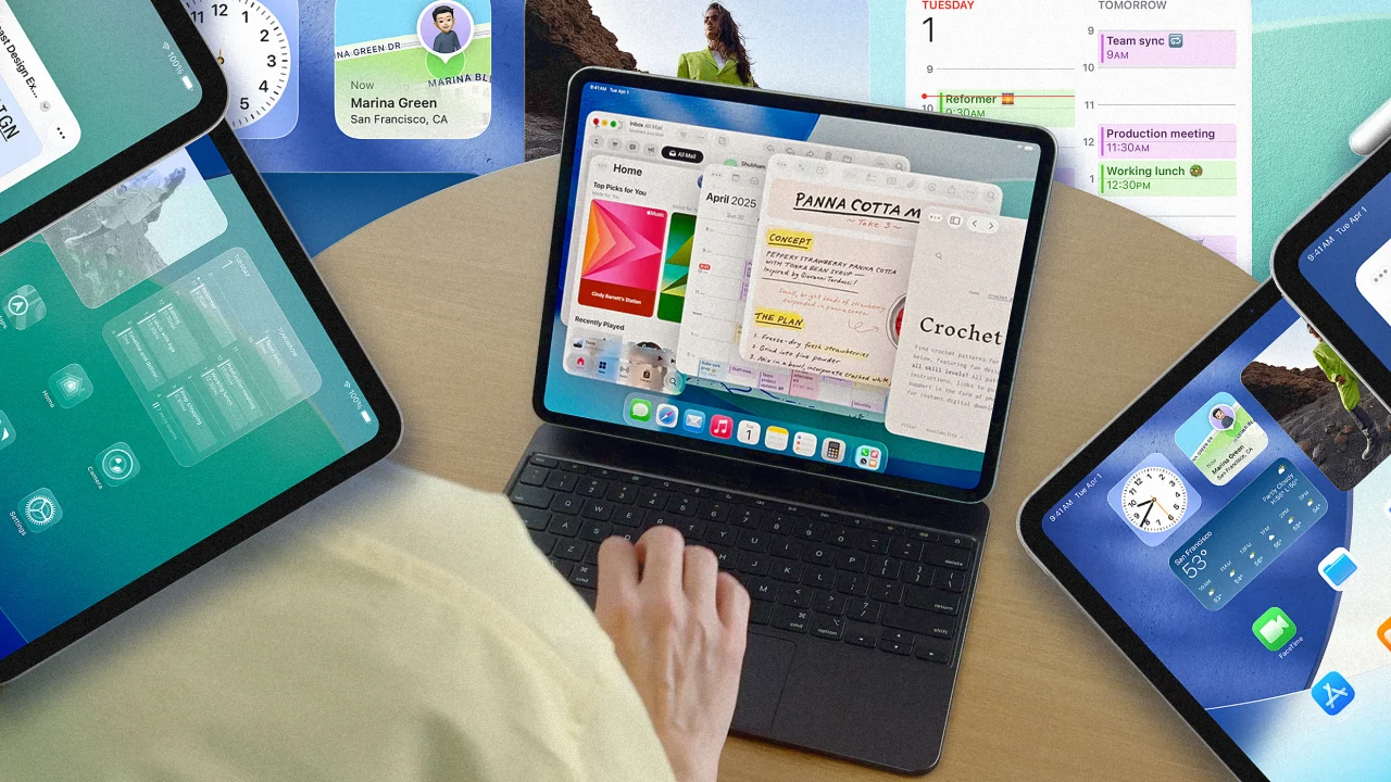
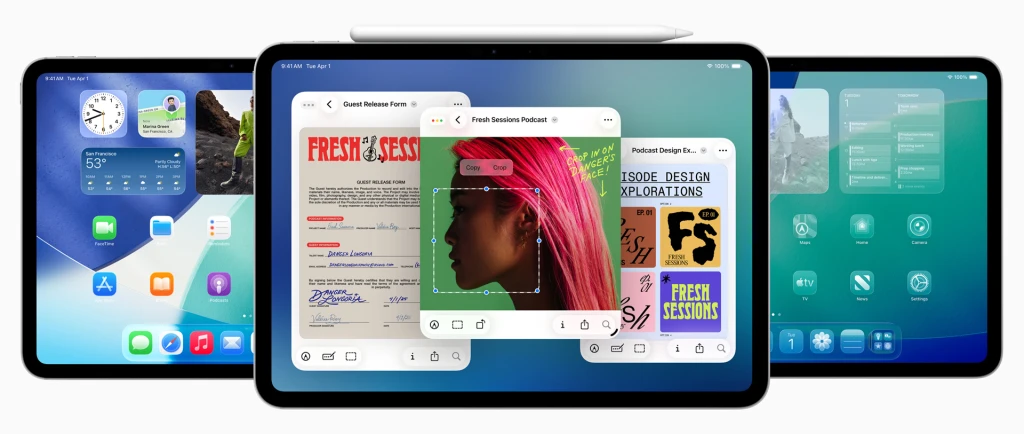
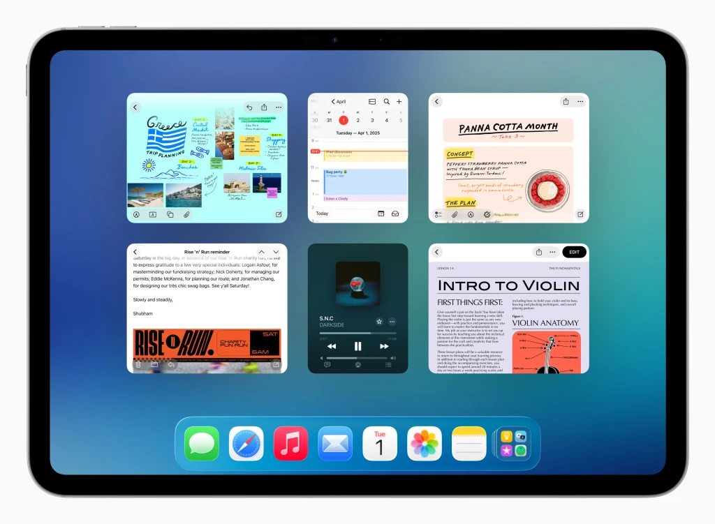
Today, though, the iPad has become a cluttered compromise. Apple has transformed the iPadOS into MacOS with some touch UX details. Now you can make apps run in windows that can overlap each other, just like the way you can run many iOS and iPad apps in the Mac. There are menus and submenus too, which run across the top of the screen in some apps, just like the Mac (but, unlike the Mac, they are not a permanent UX element, appearing and disappearing depending of the app you are running). Windows can tile, turning it into a finger-clickable oversize pop-up window.
The power of modal UX
Apple believes that all this brings more power to the user. I would argue that it detracts from it, like Raskin discovered while developing the first Macintosh computer before Jobs took it away from him in 1981. He was a computer engineer, artist, writer, and human interface expert, who originally advocated leaving the command line interface for computers with a single purpose that anyone could use without training, like a toaster or an immersion blender in the real world. These “information appliances” would have the right buttons, software, and network connectivity to perform specific tasks effortlessly. Raskin envisioned them becoming invisible to users—part of their daily life.
Eventually, he realized that having one gadget for each task was impractical. His answer was the mouse and graphical user interfaces, which he believed could bring computing a bit closer to his original idea. A computer could have programs focused on specialized tasks—like word processors, painting programs, or a calculator—with specialized interfaces designed so people could understand them intuitively.
He started the Macintosh project at Apple in 1979, hiring legends like Bill Atkinson, the father of the menu bar and countless other fundamental graphic UX elements (who sadly recently passed away), Andy Hertzfeld, the main architect of the Mac’s system software, and Burrell Smith, who created the Mac’s hardware. He brought on other luminaries like Steve Capps (who later helmed the Newton project, the origin of the iPhone and the iPad), Bruce Horn (who created the Finder), and Susan Kare (who designed all the Mac’s icons and made all things wonderful in the pixel world), and they went on a mission to realize Raskin’s vision.
Their genius ushered in the second computing revolution. And yet, the Mac wasn’t the solution Raskin had in mind. It required users to manage files and windows. It required them to learn conventions and navigate through menus, even if it was orders of magnitude more intuitive than the command line. Soon, it got too complicated—and still is to this day. No matter how many clean-up attempts Apple has tried, it’s fundamentally too complex.
It wasn’t until the iPhone and touchscreens that Raskin’s idea materialized thanks to apps that turned to the phone into a “specialize device” for each task. Later, the iPad became the ultimate expression of that powerful idea. It embodied Raskin’s core philosophy: an immersive device focused and modal, that could transform instantly into the tool you needed—a sketchpad, a typewriter, a comic book reader, a video editor. Billions of people around the planet instantly got it. One app, full screen, your mind uncluttered. The complexity was hidden; its purpose was clear.
The iPad was, as I wrote back for Gizmodo when it came out, “the future.” It wasn’t perfect by any means, but it had the potential to become the ultimate computing device. Years later, I changed my Mac for an iPad Pro. I loved it. The iPad put me in the zone and minimized distraction. I used it exclusively for several years and only changed to a Macbook Air because I needed to use Premiere for new projects.
A squandered golden opportunity
Which brings me back to iPadOS 26 and trying to understand its very existence. Fifteen years after Apple first introduced the iPad as a new form of computing we’ve landed back on the Mac. The company that once championed simplicity against the tyranny of overlapping windows and nested menus has now bolted those things onto the iPad. With iPadOS 26 the iPad is not a truly liberated information appliance anymore, free from desktop baggage. And it’s certainly not a full-fledged Mac—as it still lacks the power-user features, the robust file system, and the sheer flexibility of macOS.
We didn’t need a decade and a half to arrive at a mediocre compromise. If Apple had truly lost faith in the iPad’s unique vision—the vision that differentiated it—they should have had the guts to kill it. Just kill the damn thing and make a MacBook Air with a detachable keyboard. Go ahead. Slap touchscreens on every Mac in the line and call it a day. Just don’t make an iPad that’s less than it was meant to be, clumsily aping the thing it was supposed to replace.
Perhaps clinging to the original idea of a new computing paradigm is an untenable idea. But this compromise feels particularly bad right now, right at the very moment where there’s a clear window of opportunity for Apple.
Maybe the iPad should have gone totally away from the Mac and doubled down on AI. Maybe the iPad was already in the right place to become the true future of computing. It was a blank canvas. The right opportunity to reimagine computing around AI, to make it useful in a more natural way that is not constrained by the size of the iPhone (which I still think is the only true AI device, just too small to be useful for many things).
And no, I don’t know what that looks like. That’s why Apple’s UX designers get paid. What I do know is Apple might have squandered its chance to create a completely new AI-based computer user experience.