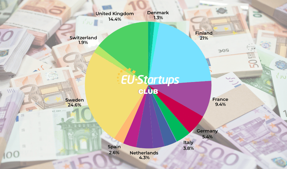
![The Largest Communities on Reddit [Infographic]](https://imgproxy.divecdn.com/vfTS-YsC_ZrqM6F4tAXJgV6qj3gCHSsf2dvHufDbrrQ/g:ce/rs:fit:770:435/Z3M6Ly9kaXZlc2l0ZS1zdG9yYWdlL2RpdmVpbWFnZS9sYXJnZXN0X3JlZGRpdF9jb21tdW5pdGllczIucG5n.webp)


![[Weekly funding roundup June 14-20] VC inflow crashes to second lowest level for the year](https://images.yourstory.com/cs/2/220356402d6d11e9aa979329348d4c3e/WeeklyFundingRoundupNewLogo1-1739546168054.jpg)


How Windsurf turned its AI coding brand into something cool enough to wear
Anshul Ramachandran knew they’d landed on something special when engineers started having opinions about color palettes. “Probably one of my favorite moments was when we showed other people at the company the brand book for the first time and I heard the audible ‘wows’ and ‘ahs,’” the cofounder and head of product and strategy at Windsurf says. “If you can get a bunch of engineers in a room to do that about colors and lines, you probably did something that works.”Windsurf, formerly known as Codeium, is an AI-based development environment that was bought last month by Open AI for $3 billion—30 times its valuation. Ramachandran’s clients are mainly engineers, and so any redesign needed to speak directly to them. So Windsurf enlisted Vancouver design agency Metalab to create a visual identity that looks more like athletic gear than business software. The result breaks every rule about how tech companies are supposed to look. [Image: courtesy Metalab]Back to the humanWindsurf builds AI tools for more than a million software engineers, helping them accelerate their coding workflows through what the company calls “seamless AI collaboration.” But their previous brand identity—a black background with teal accents—felt limiting for a product that was expanding beyond basic code generation.The previous branding iteration. [Image: Windsurf]“There’s sort of a very grayscale, kind of boring treatment to a lot of [technology] products,” says Allison Butula, marketing director at Metalab. The standard tech aesthetic had become a liability for a company positioning itself at the intersection of human creativity and machine intelligence. When machines seem to be taking over our world, it makes sense that a brand should work to make technology feel more human.[Image: courtesy Metalab]The timing of the redesign aligned with broader changes at Windsurf. The company released the Windsurf Editor in November, which generated such momentum that users began identifying the company by its product name rather than its corporate name. The company officially renamed to Windsurf in April. “It was a natural time as we were also changing the name of the company,” Ramachandran says.[Image: courtesy Metalab]The big creative riskYash Mittal, lead designer at Windsurf who oversaw the project internally, tells me the team was deliberate about taking creative risks. “At the end of this process, where do we want to be? And we’re like, we want to take this big risk. And even if it fails, we’re okay with that because we don’t want to end up with a brand that looks just like any other tech brand,” he says.[Image: courtesy Metalab]Metalab has helped to turn technical products into emotionally resonant brands in the past (including Slack). Jordan Darbishire, brand director at Metalab, anchored the visual identity in a core emotional concept. “It was the idea of feeling this unlimited potential. So it’s all about flow state. It’s all about doing your best work and the tool affording you time, which is obviously a very precious resource,” she says.[Image: courtesy Metalab]The brand flows indeed. The flat white logomark is a stylized “W” that makes it look like waves in the ocean. Its smooth thickness variations give it a hand-drawn quality, but at the same time it is precise, recalling an engineer’s calligraphy on a blueprint. The variable width typography—how the “W” letterform grows wider, then thinner, then wider again, creating visual rhythm that suggests energy and movement—”transmits a flow state,” Mittal says. The logomark also visually echoes the wordmark: The W’s curves literally repeat the delicate thin ligatures of the brand’s typeface, Tomato Grotesk, adding to the repetition and the flow Mittal speaks about.[Image: courtesy Metalab]The design process required balancing seemingly contradictory elements, Darbishire says. “We want to really meld the natural and the technical,” she says. To achieve that, the team created wavelike gradients that guide the eye through compositions while incorporating blueprint elements that communicate technical sophistication, which are at the same time a big contrast to the flat nature of the Windsurf brand and, at the same time, extend its human nature.Early design concepts and inspiration [Image: courtesy Metalab]Surfing UX AIThese pretty gradients are a key part of the brand book. Metalab developed a comprehensive gradient system with dotted line language and dash patterns that Windsurf’s designers could use to build new shapes and applications. The color palette drew inspiration from actual windsurfing sails. “A lot of them utilize these bright neon colors so you can see them on the water. It’s also sort of the design language of that sport,” Darbishire says. “It looks like it could be a windsurf, like a windsurfing athletic company. And we really want to lean into that because it’s just so unique.”[Image: courtesy Metalab]It wasn’t the most aggressively sporty option, however. The team explored directio
Anshul Ramachandran knew they’d landed on something special when engineers started having opinions about color palettes. “Probably one of my favorite moments was when we showed other people at the company the brand book for the first time and I heard the audible ‘wows’ and ‘ahs,’” the cofounder and head of product and strategy at Windsurf says. “If you can get a bunch of engineers in a room to do that about colors and lines, you probably did something that works.”
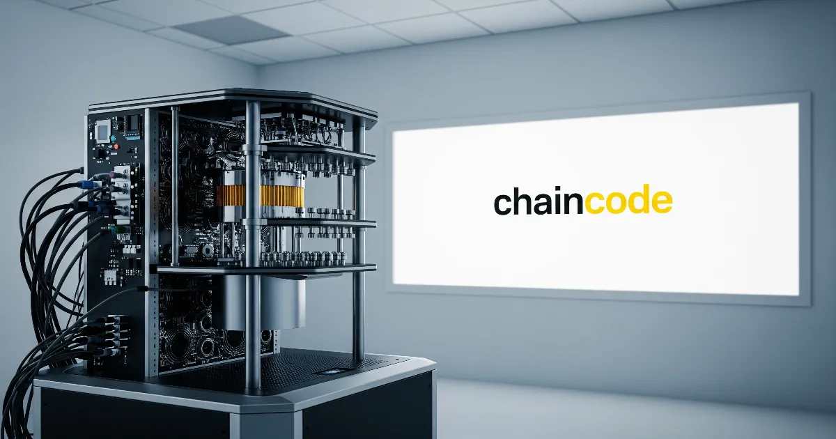
Windsurf, formerly known as Codeium, is an AI-based development environment that was bought last month by Open AI for $3 billion—30 times its valuation. Ramachandran’s clients are mainly engineers, and so any redesign needed to speak directly to them. So Windsurf enlisted Vancouver design agency Metalab to create a visual identity that looks more like athletic gear than business software. The result breaks every rule about how tech companies are supposed to look.
Back to the human
Windsurf builds AI tools for more than a million software engineers, helping them accelerate their coding workflows through what the company calls “seamless AI collaboration.” But their previous brand identity—a black background with teal accents—felt limiting for a product that was expanding beyond basic code generation.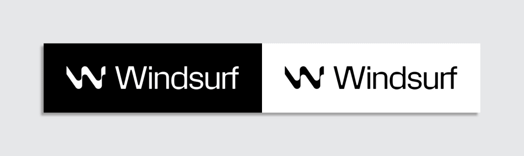
“There’s sort of a very grayscale, kind of boring treatment to a lot of [technology] products,” says Allison Butula, marketing director at Metalab. The standard tech aesthetic had become a liability for a company positioning itself at the intersection of human creativity and machine intelligence. When machines seem to be taking over our world, it makes sense that a brand should work to make technology feel more human.
The timing of the redesign aligned with broader changes at Windsurf. The company released the Windsurf Editor in November, which generated such momentum that users began identifying the company by its product name rather than its corporate name. The company officially renamed to Windsurf in April. “It was a natural time as we were also changing the name of the company,” Ramachandran says.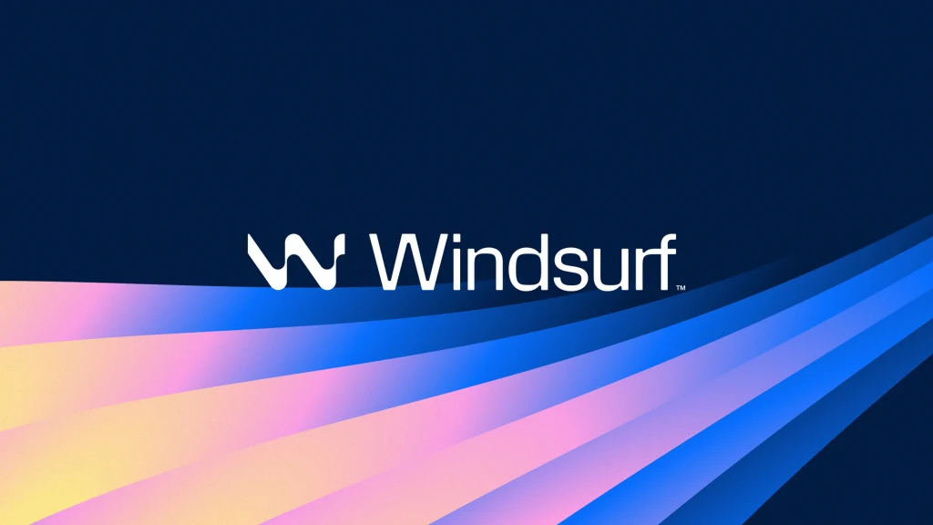
The big creative risk
Yash Mittal, lead designer at Windsurf who oversaw the project internally, tells me the team was deliberate about taking creative risks. “At the end of this process, where do we want to be? And we’re like, we want to take this big risk. And even if it fails, we’re okay with that because we don’t want to end up with a brand that looks just like any other tech brand,” he says.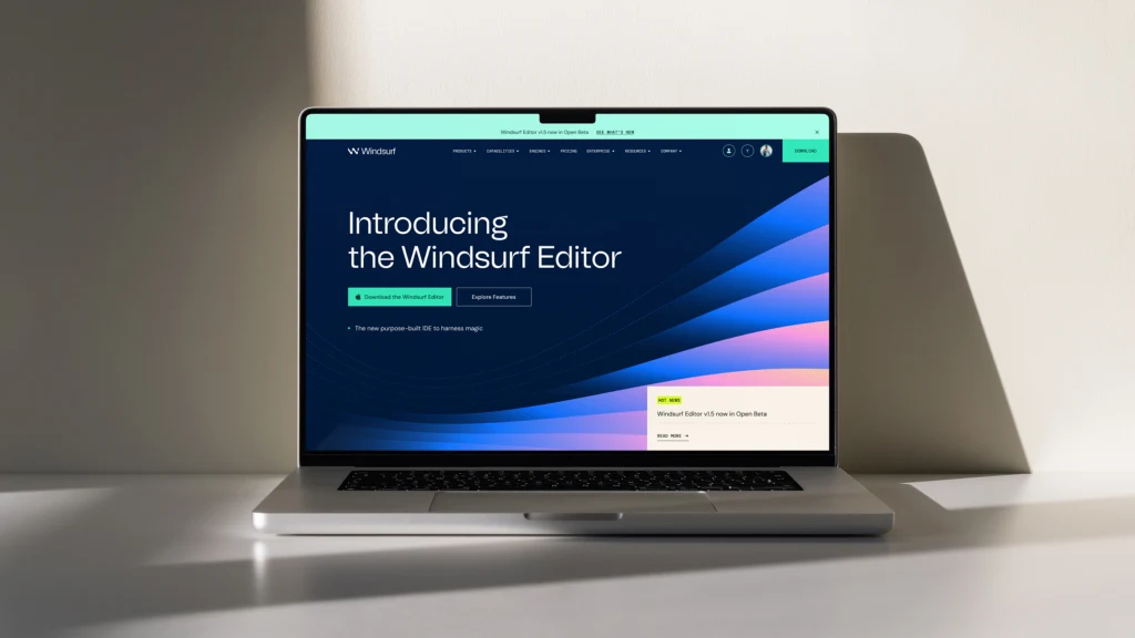
Metalab has helped to turn technical products into emotionally resonant brands in the past (including Slack). Jordan Darbishire, brand director at Metalab, anchored the visual identity in a core emotional concept. “It was the idea of feeling this unlimited potential. So it’s all about flow state. It’s all about doing your best work and the tool affording you time, which is obviously a very precious resource,” she says.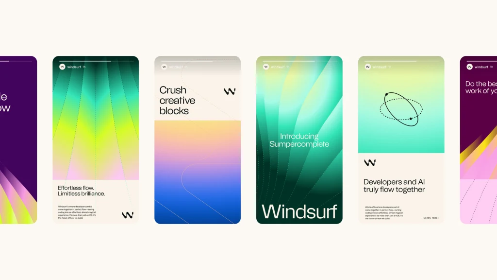
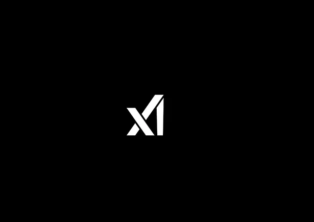
The brand flows indeed. The flat white logomark is a stylized “W” that makes it look like waves in the ocean. Its smooth thickness variations give it a hand-drawn quality, but at the same time it is precise, recalling an engineer’s calligraphy on a blueprint. The variable width typography—how the “W” letterform grows wider, then thinner, then wider again, creating visual rhythm that suggests energy and movement—”transmits a flow state,” Mittal says. The logomark also visually echoes the wordmark: The W’s curves literally repeat the delicate thin ligatures of the brand’s typeface, Tomato Grotesk, adding to the repetition and the flow Mittal speaks about.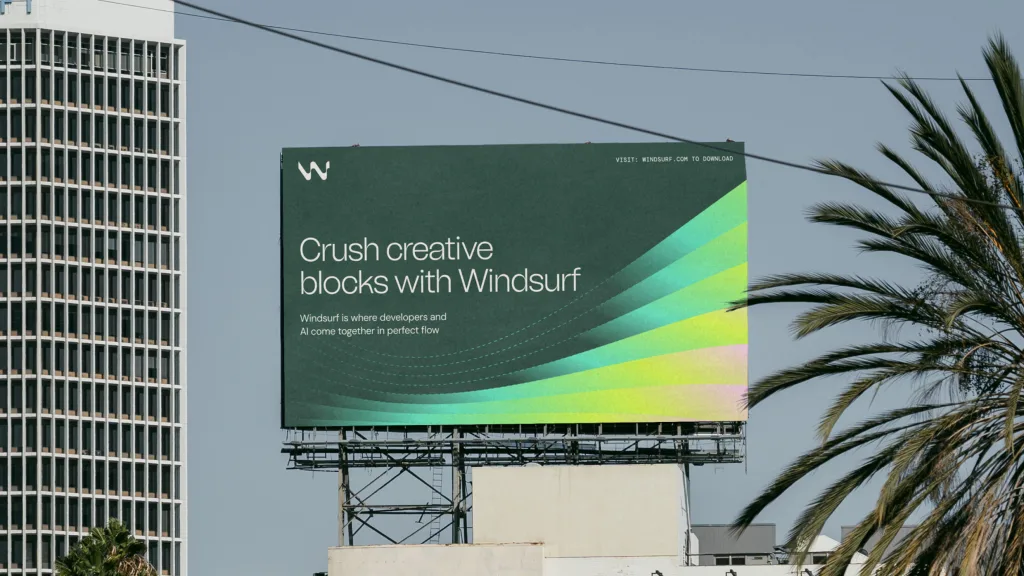
The design process required balancing seemingly contradictory elements, Darbishire says. “We want to really meld the natural and the technical,” she says. To achieve that, the team created wavelike gradients that guide the eye through compositions while incorporating blueprint elements that communicate technical sophistication, which are at the same time a big contrast to the flat nature of the Windsurf brand and, at the same time, extend its human nature.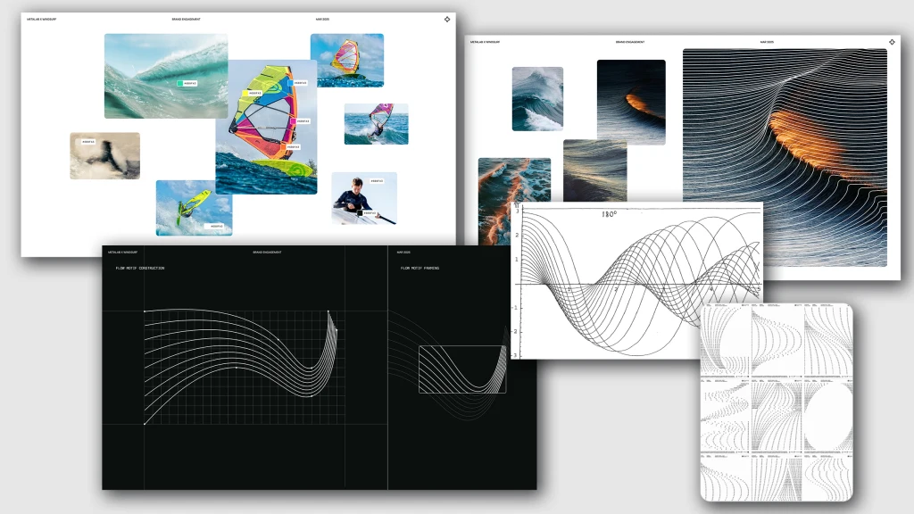
Surfing UX AI
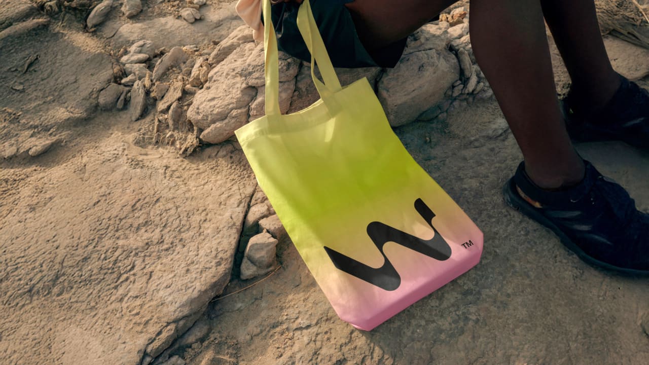
These pretty gradients are a key part of the brand book. Metalab developed a comprehensive gradient system with dotted line language and dash patterns that Windsurf’s designers could use to build new shapes and applications. The color palette drew inspiration from actual windsurfing sails. “A lot of them utilize these bright neon colors so you can see them on the water. It’s also sort of the design language of that sport,” Darbishire says. “It looks like it could be a windsurf, like a windsurfing athletic company. And we really want to lean into that because it’s just so unique.”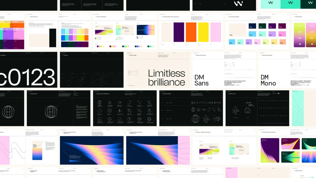
It wasn’t the most aggressively sporty option, however. The team explored directions that felt too fashion-forward, too technical, or too vibrant before finding the balance point. “We arrived at the sweet spot where we were very creative and expressive, but also we communicated our product values extremely clearly,” Mittal notes. The gradients and colors will be an element that permeates the entire UX.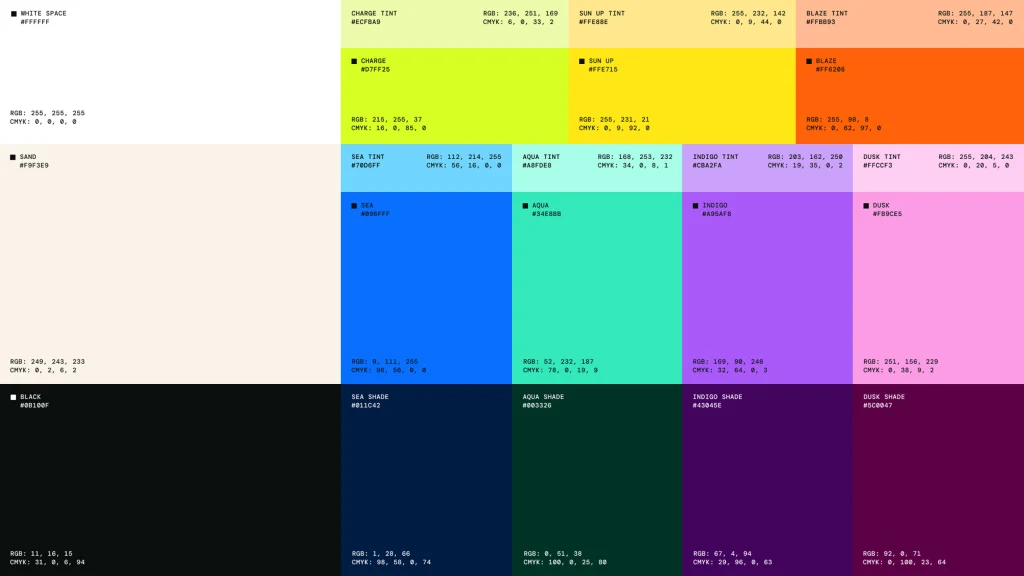
Luke Des Cotes, CEO of Metalab, says his company has had “a front row seat of these kinds of waves in technology—the big boom of crypto companies that all come forward. And now it’s been AI companies that have kind of come forward.” Creating a unique brand is key during a gold rush, he adds. “There is going to be like this real renaissance of value put towards brand as being a core differentiator,” he says.
While Windsurf launched its new logo in mid-April, testing market reception before the full brand rollout, the complete rebranding across the site and all materials happens today (a day before International Surf Day). The logo has been a success so far, Ramachandran says. “Almost all of our customers, especially on the enterprise side, they’re like, okay, yeah, that’s great. You see the W, I see the wave, I see the flow. It makes a lot of sense.”